|
Schoolconomy Redesign
|
Role
Solo UI Designer
|
Category
Desktop
|
ApproachDesign Competition
|
Duration1 week
|
Tools
Figma
|
The UI/UX Club at Kennesaw State University partnered with Hatchbridge Incubator to host the 2024 Design-a-thon Challenge. In this challenge, teams or individuals were tasked to redesign the website for one of three participating companies: ExoSkeletal Innovations, Siftr, and Schoolconomy. I achieved second place in the challenge for Schoolconomy as a solo project to redesign their landing page.
Design-a-Thon Kickoff
During the event kickoff, I learned that I'd be designing for Schoolconomy. Schoolconomy is "an education technology company that rewards students and teachers with enriching experiences and products to incentivize good grades and behavior in school." Their target users are students, parents, and teachers.
The challenge for Schoolconomy was to redesign their landing page in the span of one week. I was provided with the brand's Figma style guide, including their color palette, logos, and typography. The company requested the use of animations to engage their userbase and capture more users. They also wanted to showcase their primary product- the mobile app.
The challenge for Schoolconomy was to redesign their landing page in the span of one week. I was provided with the brand's Figma style guide, including their color palette, logos, and typography. The company requested the use of animations to engage their userbase and capture more users. They also wanted to showcase their primary product- the mobile app.
Original Design

Schoolconomy Landing Page
|

Schoolconomy Footer
|
Design Inspiration and Trends
The Schoolconomy representative provided me with sample designs to use as inspiration for the redesign:

Sample Design #1
|

Sample Design #2
|
Following these examples, I researched landing page designs for mobile apps or similar products on Dribbble. I was curious to see how each design was formatted beyond the fold, and what type of information to include. I also wanted to see how they incorporated animations throughout the page.
Design Inspo #1
|
Design Inspo #2
|
Design Inspo #3
|
Setting Up the Environment
Before creating my design, I set up my Figma file with the style guide I was given. I created text styles, color styles, and components for the provided sample screens and logos. I also created color variables in case I wanted to set up light and dark modes, but ultimately had to abandon that idea for the sake of time.

Styles and Variables
|

Style Guide
|
Design Phase
Site Content
I combed through Schoolconomy's website as well as their mobile app pages on iOS and Android for information about its core mission, functionality and features. I used this information to highlight the benefits for each target user: students, teachers and parents. I also gathered positive reviews from the App store and Play store to feature on the landing page.
Layout and Structure
|
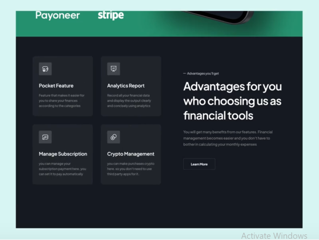
For the Hero section, I included Schoolconomy's main tagline to give users an easy-to-understand snapshot of the product. I also included call to action buttons to encourage users to get started with the app or learn more about it. App store and Play store badges are featured here to give users immediate access to the app. A blown-up photo of the mobile app is used to draw the user's attention.
|

Landing Page - Above the Fold
|
|
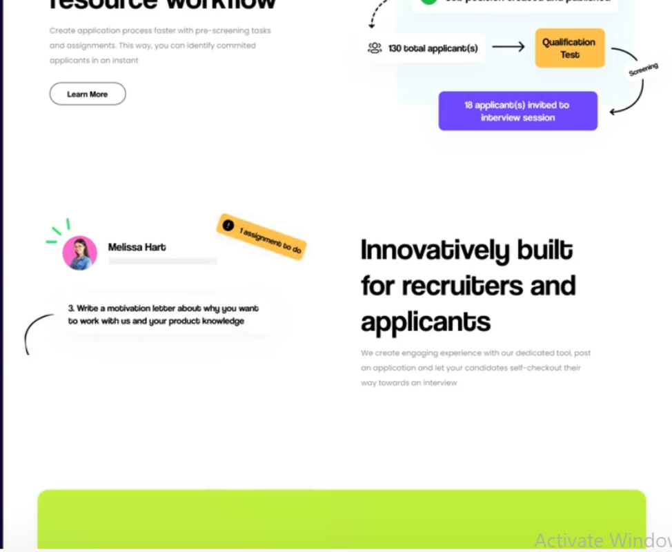
For the remaining sections, I created a card to highlight the benefits for students, parents and teachers, respectively. I used the illustrations provided by Schoolconomy to maintain consistency with the brand identity.
|

Landing Page - For Students
|
|
I added a section to showcase some of Schoolconomy's most positive reviews. I made sure to include reviews across iOS and Android to showcase the app's development.
|

Landing Page - App Reviews
|
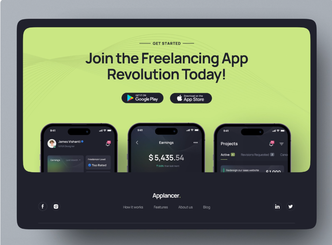
The landing page concludes with another call to action to remind the user to download the app. Additional screens from the app are showcased here to pique the user's interest. Additionally, the footer was redesigned to maintain consistent styling across the page.

Landing Page - Call to Action
|

Landing Page - Footer
|
Animations
Figma's Smart Animate feature was used to create various simple animations throughout the prototype. The initial animation of the Hero section is set to occur after a delay. As the user scrolls down the prototype, the remaining cards animate as their mouse enters the respective card's area of the screen. Finally, the carousel created for the review cards incorporates smart animate to make the pagination interactive.

Smart Animate - After Delay

Smart Animate - Mouse Enter

Smart Animate - Carousel
Final Design

Landing Page Redesign
Main Takeaways
This was my first-ever design competition. Though there was the option to compete as a team, I chose to participate solo. Despite going up against multiple teams, I achieved second place for Schoolconomy and was offered a design internship at Hatchbridge Incubator thanks to my outstanding work. I am honored to be recognized and have learned a lot from this experience.
- The winning team did a better job at explaining the user's journey through the app. I relied too much on the company's existing copy and did not iterate on their explanations and storytelling. In the future, I want to pay more attention to storytelling in my designs.
- I acknowledge the efficiency and perspective I could have gained if I had worked in a team. I ran out of time to design a light mode and a responsive mobile design. If I had teammates to collaborate with, we could have divided the workload. We also could have given each other feedback to iterate on the design.
- I should always be prepared to explain or justify my design decisions. I was given an extremely short notice that I was a finalist in the competition, which meant I needed to present my design to the judges and an audience. Thankfully, I was confident enough to explain my process and field questions from the judges.